WSES Brand Identity Design
CASE STUDY
Enhance the visibility of women in Suriname who are actively contributing to the field of sustainable energy
Approach: To begin, we conducted extensive research to gain insights into the mission, values, and aspirations of WSES. We collaborated closely with the organization’s passionate team to understand their vision and goals. After thorough brainstorming and ideation sessions, We developed a comprehensive brand strategy that aligned with their objectives.
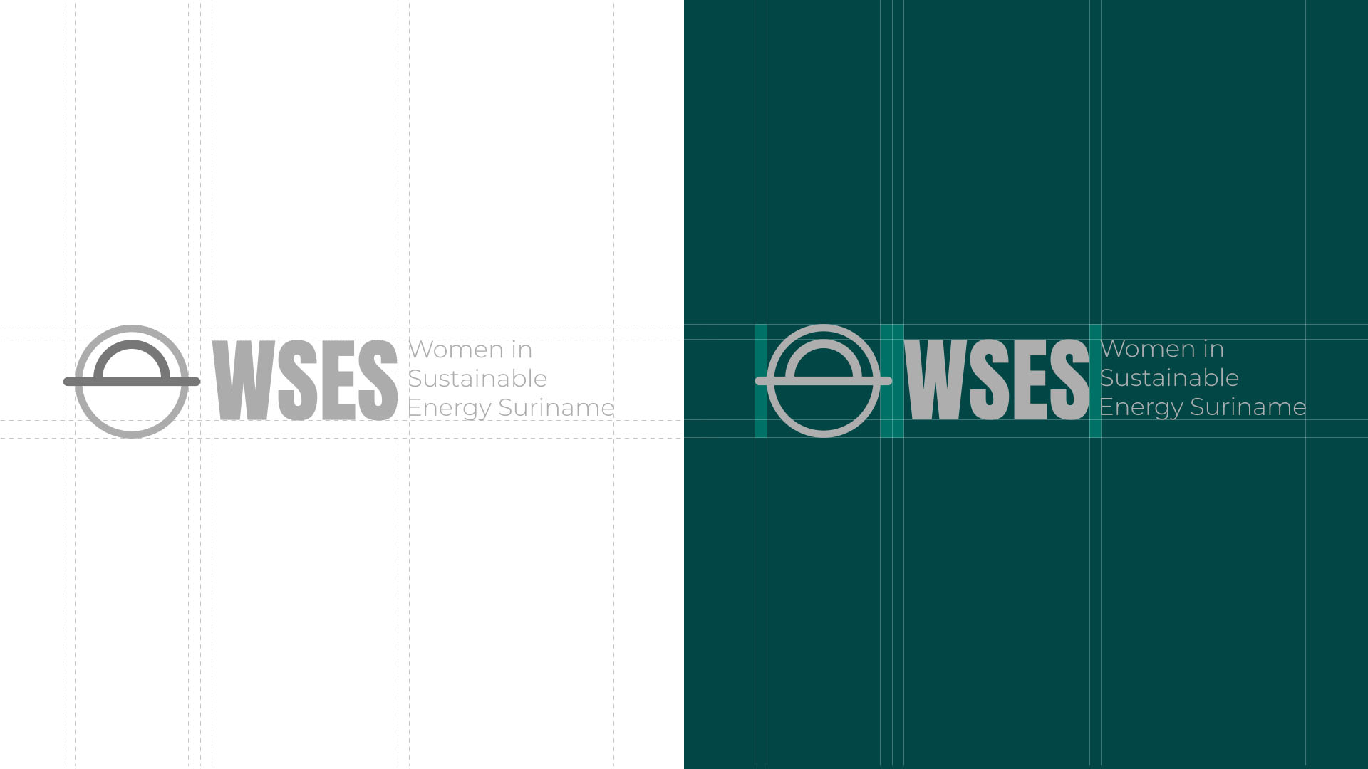
Concept and design: The brand design for WSES focused on three key elements: sustainability, energy, and empowerment. The logo incorporated a technical symbol of a lightbulb, symbolizing the harmonious integration of sustainable practices. The color palette consisted of vibrant green tones, representing growth, nature, and renewal.
Strategic Planning and Collaboration
Brand Strategy
Logo Design
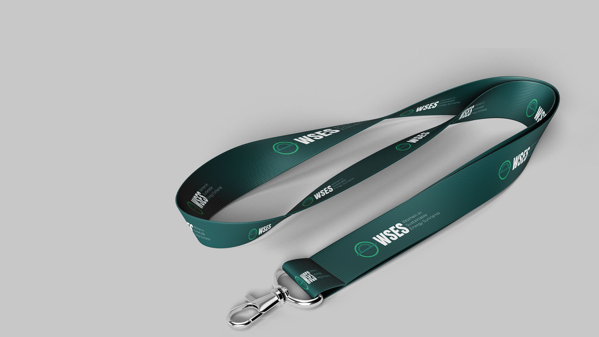
Brand Collateral Design


Conclusion
Working on the brand design for Women in Sustainable Energy Suriname was an immensely rewarding experience. By strategically combining sustainability, energy, and empowerment elements, we were able to create a brand identity that elevated the visibility and recognition of women in this vital sector. I am grateful for the opportunity to contribute to such a worthy cause, and I look forward to witnessing the continued success and growth of WSES.


